Background

Monday, March 18, 2013

DRCC Session 5 Class #8


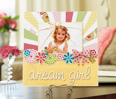
This is the lovely For Always paper pack from CTMH. The paper pack contains only black and white patterned paper which makes the colors that you choose to co-ordinate with really pop. This layout is from the Scrapbook Generation website (scrapbookgeneration.blogspot.com). I punched out different circles, then used the scissor edging technique to create dimension. I used the new black shimmer trim and the black glitter buttons for the centre of my circles. 


I used my Slice for the title using the shadow function for girl. Instead of using the dots for the i's that came with the die cut, I used some rhinestones to add some extra sparkle. 

Monday, March 11, 2013

DRCC Session 5 Class #7


I used the Surf's Up paper pack this week for my beachy layout. I wanted to tie everything together and add lots of summer elements, so I stamped some surfboards and cut them out to go with my title. I also added some words at the bottom right to add to the overall theme. As well, I inked the umbrella on the top left side in the Sorbet color and then colored the pole with a Desert Sand marker so I would have the 2 colors once I stamped my image. After I stamped it on the page, I then colored in any missing areas with the marker. I added some ribbon to the bottom and cut out some waves and a surfer from the paper and popped the image up with 3D foam tape.


I got my inspiration for parts of this layout from the latest CTMH Idea Book. There is a mini album that had a sun on one end of it and it gave me a great idea to do the same thing with this hidden journalling piece on the left side of the page. I created a template by freehanding a semi-circle on an extra piece of paper, cutting it out and then tracing it onto the folded piece of paper that would be my sun. I then took a circle punch and punched out semi-circles, making sure to overlap the edges so that I had the rays of sun. I then adhered the bottom half of the sun with the fold to the outer edge of the page. To secure the open side of the sun to the page, I used a clear tab with a blue brad to anchor it, this way it doesn't distract from the sun, but my flap doesn't stick up.


I also made a template for the inside journalling area, but I left it in the oval shape so that it still looked like a sun when it's open. 


I used the new clear 3D flowers to add some more dimension. I colored them first by sponging them with White Daisy ink and Lagoon ink. The color seems to have stayed pretty well. 

Monday, March 4, 2013

DRCC Session 5 Class #6


You're probably thinking that I have a serious red, white and blue problem lately, but I really don't. I go where the inspiration leads me and this week it led me to a July/Canada Day post. This may be more of an American theme of paper than some people might like to see, but since I had my little one in red and blue for these photos and they were taken throughout July, not just Canada Day, I thought that it still worked. I stamped a border around the large picture by straightening the original wavy stamp on my block. 


I made my own shadowing here of the stamped title by freehand cutting around the letters and the maple leaf, leaving about an eighth of an inch border around the edges. I did stamp my maple leaf twice, once on the base cardstock in blue and then again in the red and popped it up using 3D foam tape on top of the blue leaf. 


On the right side of the page, the top middle square unties to reveal another picture and a fun colored in stamp image. I only had one extra picture to place on this layout, but it has the potential to have 13 extra pictures using 2 longer pieces of cardstock and both sides of the paper. This is also a great area for private journalling. To get the multi-colored image, I stamped it first in bamboo and then colored everything in with pencil crayons. If you want a sharper look, try using markers instead. I wanted something softer so that's why I chose the pencils. 

Sunday, February 24, 2013

DRCC Session 5 Class #5


This is an old paper pack called Aspen. I love the snowflake paper and its definitely a nice gender and age neutral layout. I had also gotten the cotton ball ribbon awhile ago, I think it adds to the playfulness of the layout. I added some Stickles to the corners of the letters in the title to echo frost on the window. I also used the emboss resist technique and made some boot prints in the snow.

Tuesday, February 19, 2013

DRCC Session 5 Class #4


This week is more advanced than previous classes. I liked this layout as it has a lot of picture space and in order to put more on my layout I've incorporated a fold out of the pictures using half of a photo storage page on the right side. I'll also be demonstrating how to do the scallop edge with a corner rounder. I used the Irresistibles Dimensional Elements for my title. In order to make the emboss resist design already on the chipboard visible, I sponged Twilight ink over top of the letters. I stamped my animal critters on white cardstock, cut them out and then adhered them with 3D foam tape.


Here is the expanded view of the photo storage page mini album. I secured the folded up mini album with ribbon, a ribbon slide and brads. I left it loose enough to slide off of the page in order to expand it. 


This is the other view. I used hinges to adhere the photo storage page to the layout. I chose to put the hinges through my photo so that the picture wouldn't bubble over it, but you could adhere the photo over top of the hinges. I will be cutting the page protector to allow for the expansion of this mini album once the class is over. 


Tuesday, February 12, 2013

DRCC Session #5 class 3


As you might have noticed, this is class #3 and you might be thinking that I have forgotten to post #2, well no - I'm just waiting to get a picture to add to the layout that is currently in my moms computer that is being fixed (it's got influenza, or some kind of virus). I'll try to get it posted soon, with or without the pic. It's a cute layout using the Tommy paper. 


On to this week's layout, I've used the Claire paper pack. The small squares were easy to modify by rounding 2 of the corners. I copied that aspect with the larger piece in the middle as well as the word puzzle "journaling" piece. 

To give some more whimsy to the page I added to border on the top and bottom using this cute loop border stamp set. It somewhat mirrors the design on the zip strip that I placed on top of the new Outdoor Denim Chevron ribbon that goes across the page. You can see the zip strip and the Chevron ribbon better on the close up pics below. 


To create the word puzzle, I first stamped the 2 corners with the looped stamp so that I would know where to place my words. I then arranged the stamps with the common theme (party) on the piece of paper, moving certain ones around until I had a good fit. I filled in one blank area with a flourish stamp as the space was too small for a word.


I placed one of my bigger blocks on top of the arranged stamps in order to ink them as one. I wanted to do the "It's a Party" stamp in Outdoor Denim, so I removed it from the block, but left the space so that I could fill it in later. 


I then stamped the word puzzle in colonial white and then stamped the missing "It's a Party!" stamp in the blue in the space I had left so that it stood out more. 

This is a great alternative to traditional journaling especially if you don't have a lot to say about the occasion. The clear acrylic stamps make it very easy to arrange and see how all of the stamps will fit. It's also wonderful for a card, I've made several birthday cards using this technique. 

Sunday, January 27, 2013

DRCC Session 5 Class #1

Welcome back everyone. It was a busy Christmas and January filled with birthdays. I hope you all had a good holiday.
Spring/Summer 2013 Idea Book Cover art

With the new class comes new paper. There are some really cute papers and new products with the new Idea Book that comes out February 1st.


The first class of this session we will be using the new Buzz and Bumble paper. I borrowed my mom's Cricut to make the scalloped border and to cut out the journaling piece.

To make the banner, I punched circles out of the different cardstock and then folded them in half over the hemp bakers twine and adhered each half together.


I added the new clear flowers to the bottom pennant to give it more dimension.

Come back next week to see some more of the new paper.