Background

Showing posts with label Baby. Show all posts

Monday, November 23, 2015

Scrapaholics Unite Session 3 Class 6


I'm sorry to say that this is the last class for 2015. I will be starting another session in late January though. I've had a sneak preview of the new paper that is coming in the Seasonal Expressions book and it is cute! 

Talking about cute, my little munchkin #2 just fit with the Georgie paper pack with the fabulous pictures my sister took. At the first glance of this paper, I found it to be more boyish because it has a lot of blue hues in it, but using the yellow striped paper made it infinitely more feminine. Just like last week's layout, you can have the choice to use the circle paper as the base page or keep the yellow. I will also be giving my students the choice of title between "Sugar & Spice" or "Giggles & Grins" from the Cricut Artbooking cartridge. They are both in the same format and will work great with any cute baby layout. The versatility of this layout is such that you can place your pictures in any format that works for the pictures. Since there is no mat, you can add more or use less. 


To add some extra something, I cut out circles from the cardstock and patterned paper, then did the scissor distressing technique on them. To do the scissor edging, just open a pair of scissors and run the edge of the blade across the edge of the paper to distress it and fan it out. The more distressed, the better. It adds dimension and plays up the circles in the patterned paper. 

Sunday, November 15, 2015

Scrapaholics Unite Session 3 Class 5


Welcome to the Zoe paper pack. It is full of different colored patterned papers, like this sorbet polka dot and a glacier houndstooth pattern. It's really versatile. This layout, to me, was the perfect complement to the new Hostess Rewards stamp set #makesmehappy. It's a great stamp to go with Social media pictures. I just need to print a few more pictures for the bottom of the layout. Just ran out of time! 


I arranged several different stamps to create this "journal" block. Most of these stamps are from #makesmehappy, but some are from other stamp sets. I made the one that stood out to me, instalove, in sorbet so that it was highlighted. I accented with some 3D stars and hearts as well as some thin shimmer trim.

Sunday, September 8, 2013

Little Monkey


This paper and accessories pack is from Best Creation Inc. called Safari Boy. I think I got this pack just after Archer was born, so over 2 years ago. I had taken these pictures in anticipation of a 2 page spread because this outfit was one of my favourites. I love argyle and I love brown and blue together. Needless to say, my sister know all of this and therefore picked up this adorable outfit when she heard I had had a boy. Then I just had to wait until he was big enough to wear it. At least he could play with the stuffed monkey from the beginning, which he loved! It was a great toy for him to chew on. Lots of arms and legs to go in his mouth. Just what a baby loves. 


For this layout, the pack came with these 2 sheets that I used as my base pages with a scene already on them. I love that certain aspects of the whole kit had glitter on it. Even though its a boy paper pack, the glitter works. I strategically placed the cut out in the centre of the pages to frame the pictures. I used the very appropriate sticker title included and just made a pennant background for it. We do call Archer monkey all the time, because he acts like one! The larger hearts were actually stickers that I dusted baby powder on the backs to get rid of the stickiness and then adhered them with 3D foam tape. I found the argyle ribbon at Michaels one day and knew it would perfectly match this paper pack and this layout. 

Friday, June 8, 2012

DRCC Session 3 Class #6


I have been wanting to use the wide chocolate and colonial white ribbon for quite some time now, but I just never seemed to make it work on a layout. This layout originally has a piece of paper in place of the ribbon, but I wanted to bring a different color onto this layout other than blue, considering that my pictures have red as the dominant color. I hope that you also think that the blue and brown balance out all of the red. I used rub on letters for the title and added some scalloped 3D accents.

Thursday, November 24, 2011

DRCC Session 1 Class #5


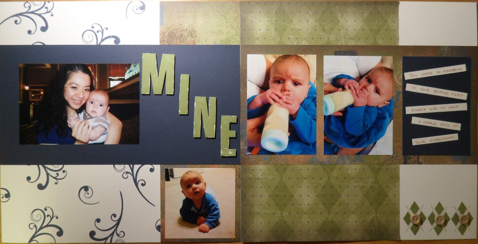
This week we will be creating our own background page by random stamping. We will also be exploring a different kind of journaling using strips of paper. I also added some embellishments using the new wooden buttons.

Monday, October 31, 2011

DRCC Session 1 Class #1


I'm teaching a scrapbooking class at the Deer Run Community Centre starting tomorrow evening, November 1, and I'm hoping to use my blog as a means to teach some other people as well. It's a 10-week course and we will be completing a 2 page layout during each class.

This is the first layout that we're doing and can be changed to be party or children themed . It's a fairly simple one to get started, but it's teaching some basics. I'm concentrating on stamping with this class, although we are using chipboard and brads as 3D embellishments. The lesson is also about continuity. You can see that I'm repeating the stitching pattern that is on the star paper on my larger chipboard stars as well as using a similar flourish in the title as in the inner stamped star on the larger stars.

Please send me a message if you're interested in joining the class.

Thanks for stopping by!

Wednesday, May 11, 2011

Along came a baby

Sorry for the hiatus, but my little guy was born January 21 so we've been kinda busy since. I have been scrapping though, but not been able to blog. Here's a layout I just made on the Scrapbooking Retreat that we just had this past weekend in Banff. I had picked up the extra large buttons in a clearance sale about 4 years ago and finally was able to use them on this layout. Just goes to show that if you keep things long enough, you will eventually use them. I used my sister's Cricut Expression for the train (B is for Boys cartridge). I used the Friendship Large Alphabet for the title as well as heat embossing the stamped letters with clear powder just to make the title stand out. One technique I did learn from my sister recently was to use a white gel pen on colored paper to have the journaling stand out.